Options
Please simplify new indicators; no greyed-out crew in quarters
 ·§ë· For the Many
✭✭✭✭✭
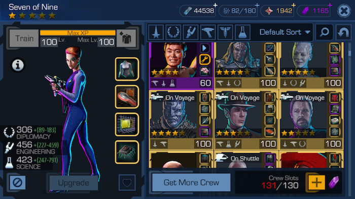
The new update brings some nice changes. However, the "On Voyage/On Shuttle/Battle Station" indicators are a bit much; I feel they have made the crew quarters less clear on the mind. I'd prefer if:
- No greying out of crew
- Instead of "Battle Station" etc across crew's face, just a small "B", "V", or "S" in the corner.
- And/or stick with only the small image icons of a shuttlecraft, voyage/ship, or battle station.
Thank you!


- No greying out of crew
- Instead of "Battle Station" etc across crew's face, just a small "B", "V", or "S" in the corner.
- And/or stick with only the small image icons of a shuttlecraft, voyage/ship, or battle station.
Thank you!


1
Comments
Well, the reasoning behind it is sound. You are prevented from freezing, airlocking or fusing crew who are on shuttles or voyages (and, I just learned, on your battle stations, as well), so at least that notification tells you why, in case you forgot and were wondering how come you couldn't do that. We get a fair amount of posts from new-ish players here in the forums wondering exactly that, until we ask if that crew is tied up somewhere.
But the way they've implemented it is obtrusive, for sure. Covering up and graying out so much of the crew thumbnail is not the most pleasing way of doing it.
Could you please continue the petty bickering? I find it most intriguing.
~ Data, ST:TNG "Haven"
Except in 3.0 they gave you reasons when you tapped the lock/airlock button on the screen. It told you if the character was on a shuttle or voyage, etc already.